
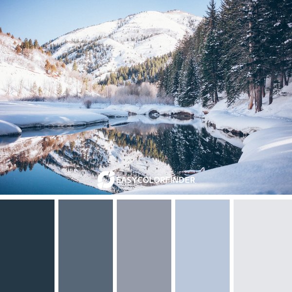
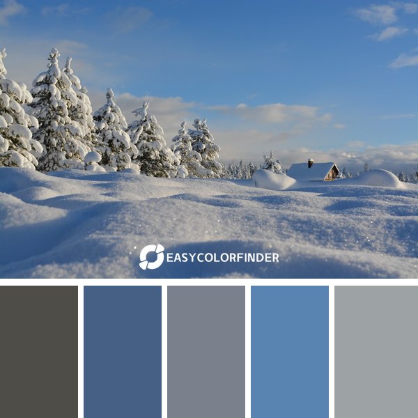
1 | The Serene winter Palette
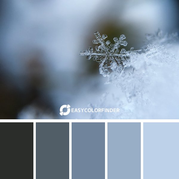
This sophisticated palette combines multiple color relationships for dynamic visual interest.
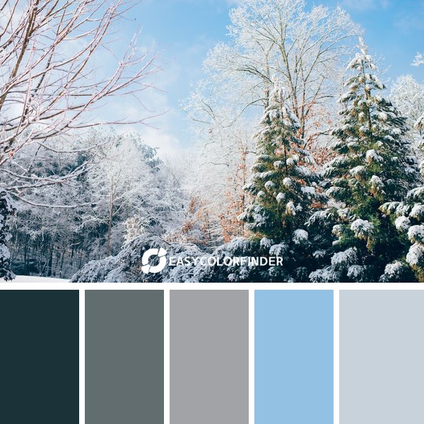
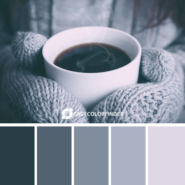
2 | Elegant Tones - winter
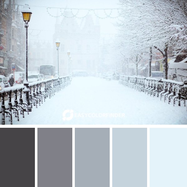
This sophisticated palette combines multiple color relationships for dynamic visual interest.
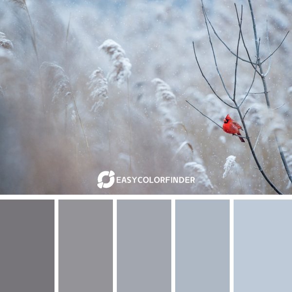
3 | winter Essence #03
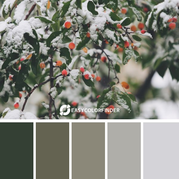
Opposite colors on the color wheel create maximum contrast and visual impact while maintaining balance.
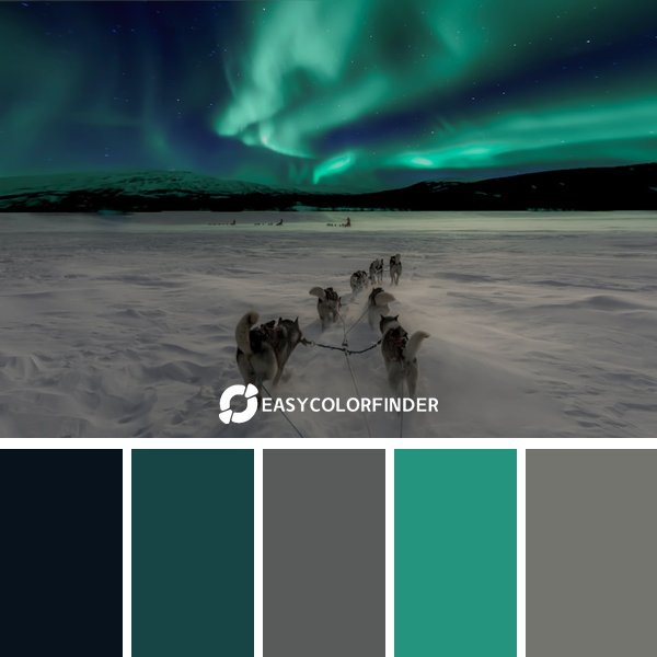
4 | The Soft winter Palette
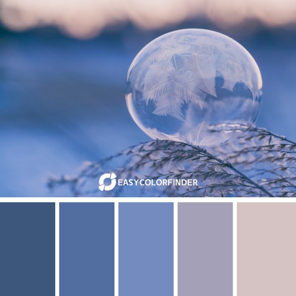
Three colors evenly spaced on the color wheel offer vibrant yet balanced combinations.
5 | winter: Dramatic Edition
These colors share similar hues, creating a cohesive and harmonious palette through tonal variations.
6 | winter Fusion #06
Adjacent colors on the color wheel work together to create a naturally pleasing and comfortable design.
7 | Dramatic Symphony - winter
Adjacent colors on the color wheel work together to create a naturally pleasing and comfortable design.
8 | winter Balance #08
This sophisticated palette combines multiple color relationships for dynamic visual interest.
9 | Modern Harmony - winter
Opposite colors on the color wheel create maximum contrast and visual impact while maintaining balance.
10 | winter Harmony #10
This sophisticated palette combines multiple color relationships for dynamic visual interest.
Frequently Asked Questions
Avoid overly saturated or cliché winter colors. Instead, experiment with unusual pairings like dusty rose and teal, or a mix of deep blues and warm creams. Look to contemporary art and design for inspiration, drawing from subtle color combinations rather than the expected. Adding a touch of a trending color like Electric Blue can also help modernize the palette without sacrificing the winter feel.
Several online tools can help. Adobe Color is excellent for exploring color harmonies and creating custom palettes. Coolors.co provides random palette generation, which can spark fresh ideas. Don't forget to test your chosen palette on different devices and screen sizes to ensure consistency across platforms. The goal is to see how well it works in the context of actual projects.
Gather feedback! Show your palettes to others and ask for their initial impressions. Does it evoke the feeling of winter? Does it feel balanced and visually appealing? A/B testing on marketing materials can also show which palette resonates best with your target audience. Numbers don’t lie, and testing is key.
Always consider contrast ratios between text and background colors. Tools like WebAIM's Color Contrast Checker can help. Aim for sufficient contrast to ensure readability for users with visual impairments. Beyond text, ensure enough contrast between image elements and backgrounds too.
The principles remain the same across mediums. However, print often requires a slightly different approach to color management and CMYK conversions. For web design, ensure your color codes are optimized for digital screens. For both, always test your palettes in their intended formats before finalizing the design.
0 Comments:
Post a Comment